Keep Path
Keep Path is a web-based enterprise platform that empowers employees to make better use of their employee perks and benefits while managing their personal finances. While many financial tools do not streamline employee and personal finances, Keep Path aims to bridge this gap.

I was on a team consisting of 3 other UX/UI designers, 1 developer, and 1 PM. We were challenged to enhance the experience of three main user flows. Each had its unique set of problems to solve.
ROLES
UX/UI Designer
DELIVERABLES
user research and testing, competitive and heuristic analysis, low and high fidelity mockups
TOOLS
Figma
01
Understanding
The Scope and Limitations

During out first discussion, the PM presented us the app and explained the known weaknesses of the app to the team. We were given design constraints - their design system to follow. Following the brief, we came up with a plan to solve those weaknesses, uncover key experience issues with user testing, and address them.
02
User Research
User Interview Methodology

We interviewed a total of 25 people to understand their behavior, pain points, and goals relating to financial wellbeing. The participant criteria were:
  • Employees from any age group and financial background
  • Employees who recently moved jobs or roles were a bonus
The first part of the interview focused on how users access their company benefits info. The second part was usability testing sessions. In these sessions, we showed the Dashboard to users to collect direct input on how they would use the system.
Analyzing the Insights


We consolidated the interview notes into key insights and grouped similar insights within an affinity map. We identified 14 main topics/concerns of participants.

Key insights Learned about Users

History of abandonment: Interviewees predominantly rely on banking websites and apps (e.g., Citi, Chase) as their primary financial tools. Some have experimented with third-party services like Mint but abandoned them due to a lack of valuable insights and useful information.

Long-term goals: All interviewees share substantial long-term financial aspirations, such as home ownership, but a portion of them lack a systematic method for tracking these goals.

Barriers to access: Accessing information on company perks and benefits is currently cumbersome, involving navigation through various platforms and reliance on multiple sources. Streamlining and centralizing this information would enhance accessibility and understanding, enabling users to maximize potential benefits.
Reasons to change jobs: When it comes to job changes, our interviewees prioritize factors such as salary, work environment, opportunities for career advancement, and the impact of the cost of living. Perks and benefits play a relatively minor role in their decision-making.

Important benefits: Our interviewees place the highest importance on benefits related to health, dental, and vision insurance. However, these crucial benefits are often scattered across various insurance providers, making accessing them a cumbersome and frustrating process.

User testing session of the dashboard: Dashboard lacked flexibility and learnability. When the interviewees were asked to rank which calculators and data graphics were most important to them, the answers varied greatly. This revealed that user needs of the info on the dashboard varies greatly.
Analyzing the Insights
We consolidated the interview notes into key insights and grouped similar insights within an affinity map. We identified 14 main topics/concerns of participants.

03
Ideation & Design
How can we enhance app's usability to cater to the diverse financial needs and understanding of users?

High Customization Option: Custom recommendation of what the dashboard widgets should include based on the user’s age, living situation, and salary.
Medium Customization Option: User can add widgets with a preview of the widget. Cards are re-sizable and movable.
Low Customization Option: User can configure which widgets are on the dashboard through a modal. Widgets are not re-sizable nor moveable.

After discussions with the PM, because of the timeframe of the project and technical limitations, we decided to go for the low customization design.


Video flow of customizing the dashboard


Improving the learnability

From the user testing sessions, we discovered that users didn’t know what to expect to see if they were to click on some of the page links. This demonstrated that the page names were not clear and this confusion needed to be addressed. We adjusted the page names to be more precise and used more common known language. Analyzing competitor apps to see what the industry standard terms are helped as well.
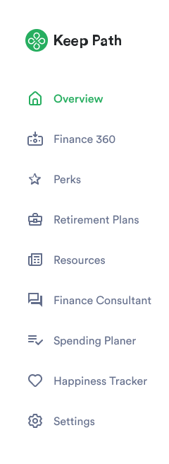
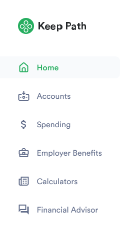
  • "Perks" to "Employer Benefits"
  • "Spending Planner" to "Spending"
  • "Finance Consultant" to "Financial Advisor"

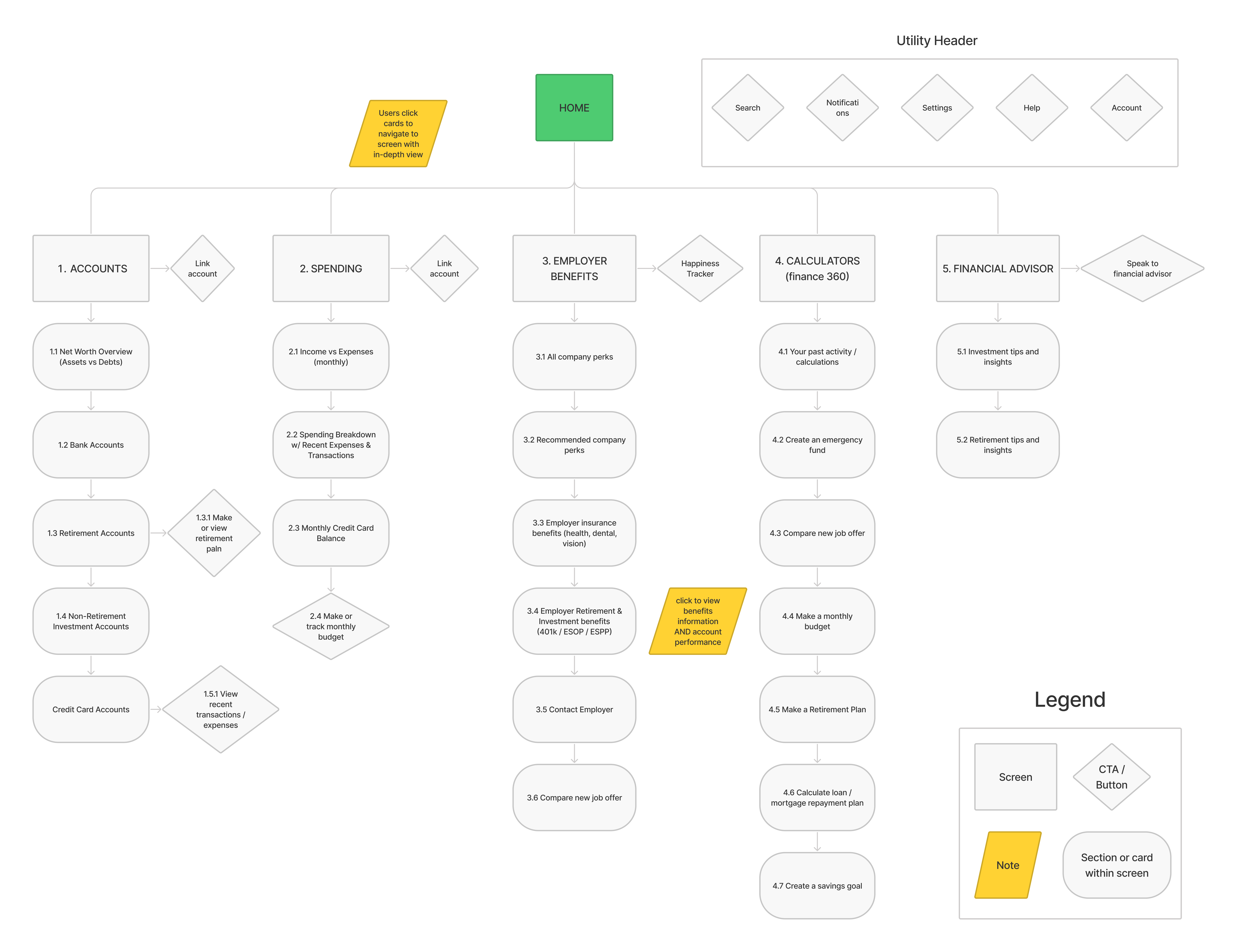
Organizing the sitemap

Users in the testing sessions expressed confusion about what all the links and different features were for. We conducted a card sorting exercise with the users, asking them to group the app's concepts, and adjusted the navigation accordingly. Below is a before and after and the new sitemap.


Additional minor improvements:

  • A more clear data visualization for the spending breakdown
  • A consistent color coding to represent a need, want, or saving
  • Links on each widget to map to the main pages for more details
  • More clear action buttons

Dashboard: Before


Dashboard: After


How can we enhance app's usability to cater to the diverse financial needs and understanding of users?

Initial audit of the page

The information architecture of the current screen is confusing, particularly the division down the center of the screen, which seems to symbolize a comparison between each side. However, upon closer inspection users can see that it’s the cards that contain the comparison of current position versus new position, and that the line drawn down the center of the screen serves little to no purpose.


What needs to be fixed

  • Some new information needs to be added, such as whether a new position requires a relocation, and whether that relocation will cause an increase or decrease in overall living costs - which is one of the main concerns people expressed in the user interviews.
  • Each card will contain a rationale that will explain the calculation behind each comparison.
  • Form screens will need to be designed in order to gather important information regarding the intricacies of a user's new position.

Brainstorming

We began sketching out 8 different ideas for structuring the new job analysis screen. The most important part of this exercise was coming up with ways that make the comparisons more immediate than the current screen, while also making the page scannable and not so overwhelming.


04
Testing & Feedback
Usability testing

To test the high fidelity mockups, I tested the prototype on five users. The following are the insights.

Increasing scannability: While the cards are easy to digest overall, users were craving slightly more scannability for them to make more immediate decisions regarding the pros and cons of moving jobs versus staying in their current position.

Editing submitted information: Currently the “Update Job" CTA guides users back to the form screen they have already filled out. Users found this slightly jarring, and it took them a moment to understand what was going on. There should be a way to edit the information without being transported from the new job analysis screen entirely.

Page header confusion: The overview / breakdown at the top of this screen is slightly confusing at first glance, with the cost of living section on a separate line. Similar to the first insight, this needs to be restructured slightly to increase scannability and immediacy

In response to these insights we have made changes to the high fidelity mockups shown below.


How might we help users to take more advantage of company benefits?
We improved the Spending page including:
1. The user can now easily toggle among Needs, Wants, and Savings.
2. The detailed spendings list notifies the employees of potential benefits in cash flow which is a crucial flow Keep Path should address. This would help bridge personal finances to company perks.
3. The expanded table allows users to easily locate and review all spendings and savings.

Before redesign


After redesign


05
Reflection
This was a very rewarding project and experience to learn about financial well-being. As a recent graduate, I have not thought much about switching jobs and employer benefits. After interviewing users and hearing their stories and preferences, however, I have gained a new understanding of employers!

With the team of four UX designers, we were a small, yet mighty team. It was interesting to see the work flow of other designers and intriguing to see how others design different solutions to the same problem.

Although it was convenient that a style guide was given to us, it was critical to design under the exisitng component library to keep everyone's designs cohesive.

Other ideas for dashboard customization that involve more of the development team are to use 1. the demographics of the user or 2. the number of times a user clicks on a link to create a default/personalized dashboard.st part of the interview focused on how users access their company benefits info. The second part was usability testing sessions. In these sessions, we showed the Dashboard to users to collect direct input on how they would use the system.