Vectice
Vectice is a SaaS web application that captures metadata, lineage, and context of AI assets with simple APIs to generate documentation.

For this project, I drove the navigation revamp, conducting usability tests, creating multiple prototypes, and iterating designs and interactions to pixel-perfection.
ROLES
UX/UI Product Designer
TOOLS
Figma, Adobe Photoshop, Illustrator
DURATION
May 2021 - Current
01
The Problem
Users encountered challenges navigating between different levels of the app, struggling to seamlessly move from deeper sections back to the main interface. Additionally, users found it difficult to discover and recall specific tasks associated with each level, ranging from workspace to project, phase, datasets, models, and iteration.

02
Discovery
Known weaknesses of the navigation
Throughout the year, teams, especially sales, sporadically reported difficulties in app navigation, particularly for first-time users. I proactively tracked and documented these UX issues, paving the way for a targeted navigation revamp project.


Uncovering issues with the current navigation
I gathered multiple participants with a technical background to conduct usability tests on. It was crucial to write unbiased scenarios and open ended task-based questions to observe how first time users navigated the app. I observed their screens, cursors, thoughts, and hesitations and closely took notes.

Below are a few friendly faces whom I interviewed.


03
Key Findings
Problem 1: Users struggle to know where they are in the app and at which level they are in.


Problem 2: Users find it difficult to discover and remember what actions they can do on asset pages. They also expressed being overwhelmed by information.


Problem 3: Users struggled navigating from deep within the app from the iteration page (fourth level) to the phase’s documentation page (third level).


Problem 4: Users struggle to navigate betwen a workspace and projects and feel overwhelemed by all the menu options.

04
Defining the goal
Goal
Enhance the discoverability of Vectice's content and features by establishing a consistent and intuitive navigation system. Users should easily locate and anticipate the functionality of features, promoting a seamless and predictable interaction experience.

Scope & Limitations
Given the tight project timeline, the designs were created to efficiently address the issues without burdening engineering resources. Additionally, I made sure to use existing components to ensure uniform experiences, interactions, and typography across all pages. Here's a snapshot of a section of Vectice's design system that I actively maintained.
05
Ideation & Design: Problem 1
Problem
Users struggle to determine their location within the app and identify their current level.

Hypothesis
The lack of visual hierarchy (workspace → project → phase → iteration) affects users’ brains’ ability to scan and zone in on areas of interest. I experimented with various navigation structures and visual hierarchies. Subsequently, I developed prototypes for both the team and users to test out.

Prototype 1: Double Sidebar
The workspace and project are presented vertically to emphasize the hierarchy. Upon clicking into Phases, the sidebar dynamically opens to the right, preserving the top level and ensuring users stay within the relevant context. This design approach enhances both hierarchy clarity and user experience.


Prototype 2: Nested Sidebar
In this design, the workspace is distinctly separated from the project and phases sidebars. Notably, the project and phase sidebars dynamically switch, a strategy employed by platforms like Jira for deep-level navigation. This switching contextual sidebar enhances navigation efficiency and user experience.


Prototype 3: Horizontal and Vertical Sidebars
The project and phase sidebars are intentionally kept separate, ensuring a clear distinction between these two concepts. This design choice prioritizes clarity and avoids potential confusion, contributing to a more user-friendly navigation experience.


06
Ideation & Design: Problem 2
Problem
Users have a hard time discovering and remembering what actions they can perform on an asset page.
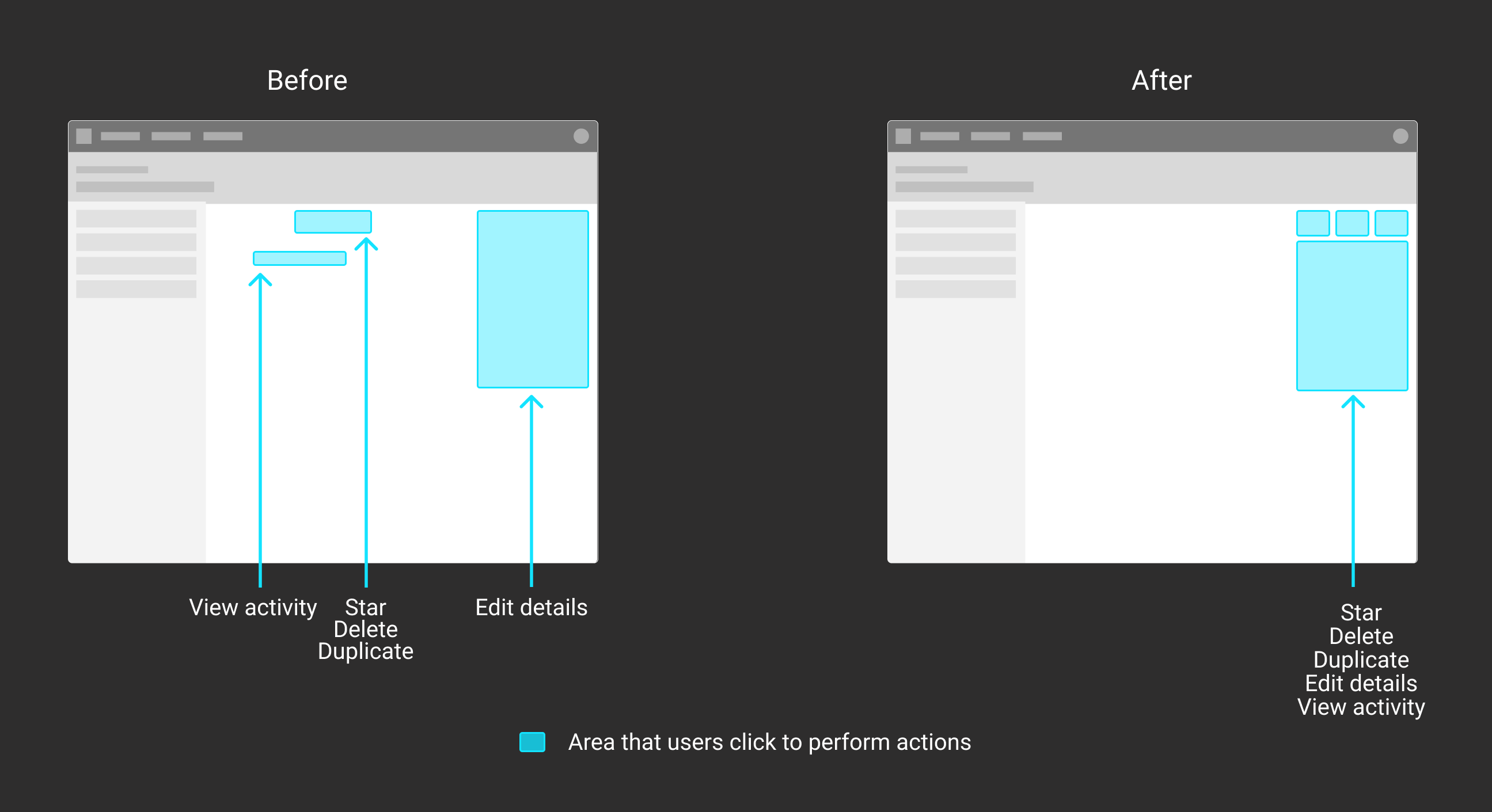
Hypothesis 1
Grouping actions in one area of the page will help users to remember where they can find features. Displaying only the main content and hiding secondary information will as well.

Design Adjustments
I organized actions into a panel on the right side of the page, prioritizing essential details for immediate visibility. Secondary information, such as activity logs or actions like asset deletion, can be accessed by clicking on corresponding icons, allowing users to explore additional details as needed. This design enhances usability by presenting key information prominently while providing easy access to supplementary features.


Video of Figma Prototype


Hypothesis 2
Due to Vectice's unique approach in conceptualizing the steps of a data science project, users sometimes face challenges in understanding how to effectively use Phases and Iterations. To improve the first time user experience, it would be helpful to guide the user to the actions he/she needs to complete. In the original experience, a user would land on an empty Iteration page with no guidance nor directions.

Design Adjustments
We first mapped the ideal user flow. It became clear that the phase should have a summary page where the app guides the user to configure the phase and have quick access to important assets deep within the phase. After researching many FTUX’s of data science apps (such as Kaggle, Huggingface, CometML, and Weights&Biases), I was inspired to add a “Suggested actions” section. Once the user completes a suggested action, the action card dynamically disappears. We ordered these actions according to the user flow, so that the next action is displayed first in the list. Users now can learn how to use Vectice while making progress on their projects.

Video of Figma Prototype
The following shows a simplified flow of the user landing on an empty Phase and following the suggested actions.

07
Ideation & Design: Problem 3
Problem
Users find it difficult to navigate from deep within the app (iteration page) to the phase level.

Hypothesis
Including phase menu items like 'Documentation', 'Iterations', 'Reviews,' etc., in the left sidebar is a strategic move to maintain user context, facilitating smoother navigation and enhancing the overall user experience.

Design Adjustments
Rather than listing starred iterations in the phase sidebar, prioritize the sub-navigation in that space. Although starred iterations are important for data scientists to go back to, featuring them on the Phase summary page should suffice for users to easily access and view this information without compromising the importance of the sub-navigation in the sidebar. This adjustment ensures a balanced and effective use of the sidebar real estate as well.

Video of Figma Prototype


08
Ideation & Design: Problem 4
Problem
Users find it hard to navigate between the workspace and a project.

Hypothesis
Implementing visual adjustments can effectively differentiate between workspaces and other elements, creating a clearer hierarchy and emphasizing the elevated status of workspaces within the overall structure. I experimented with many different font weights, font colors, and subtexts.


Design Adjustments
The best option was the one that minimizes the use of the blue primary color the least, reserving it for active pages or hovered links to effectively draw attention to key areas of the screen. Additionally, consistent icon usage for workspaces and projects across the app ensures instant recognition for users, contributing to a more cohesive and intuitive visual experience.

Video of Figma Prototype


09
Usability Tests
& Insights
Process
To address the four main problems, I formulated task-based questions and conducted usability tests with 10 participants. Like the initial testing session, I meticulously observed their on-screen actions to gather insights and assess the effectiveness of the proposed solutions.

Key Insights
Surprisingly for Problem 1's designs, users had the most difficulty navigating Prototype 2: Nested Sidebars. Although Jira uses this type of swtiching contextual sidebar, it seems like the switching sidebar confused users. This could be because Vectice's concepts and structure are quite unique to data science. Overall Prototype 3 (Horizontal and Vertical Sidebars) and Prototype 1 (Double Sidebar) resulted in users completing tasks with the least time and minimal hesitation. However, some users expressed how the double sidebars were a bit overwhelming.

In last part of the test, we asked the same question about the original navigation bars and the new navigation bars, and users were more quick to describe what workspace and project they were in with the new one. This shows that the more minimal deisgn of Prototype 3 (Horizontal and Vertical Sidebars) that included the visual adjustments to solve Problem 4 was the easiest to read and use.

Additionally, once participants found the section the edit an asset, they quickly were able to locate the action area on other pages. This also validates Problem 2's first hypothesis. Users also had a more clear idea of what they should do next when first landing on the Phase page, validating the 2nd hypothesis.

All participants effortlessly navigated from deep within an iteration page to other phase level pages, validating the Problem 3's design hypothesis.


10
Discussions with Engineering
Alignment
After careful consideration, Prototype 3 with horizontal and vertical sidebars was chosen over Prototype 2 (Double Sidebar) due to engineering constraints within the short project timeframe. Engineering also asked questions such as how the screen will look if it was minimized. I made sure to specify this out on Figma and explained to them.

Design Audits
Following implementation, I conducted design audits to check if the implementation matched the UI designs I created. During design meetings I led, I communicated to the Frontend Lead the minor fixes to be made and created jira tickets for them as well.
11
Reflection
This was a large project that required me to be very detail-oriented as I had to create the UI, interactions, menus of every single page. What was super helpful while creating each page were components and variants —spending a mere 10 minutes on a component spared me hours of tweaking details across numerous pages!

Precision was essential, not only in achieving pixel-perfect designs but also in effectively communicating new micro-interactions and visual adjustments to the frontend team. While not every implementation was flawless initially, iterative feedback and corrections led to a polished final product ready for release.

If I could rewind time, I would have liked the opportunity to infuse more visual appeal into projects or workspaces. Incorporating elements like a vibrant cover photo or an engaging workspace avatar could have added an extra layer of delight, making the app a more enjoyable experience for users.